
|
| Cultural Migration | Creating the Context Data Analysis |
|
Creating the Context Home Research Focus Background Info Research Methods Data Submission Results of Study Data Analysis Conclusion Further Research Guided Research Research Question Background Info Research Methods Data Submission Results of Study Data Analysis Conclusion Further Research Research Values Student Research Doing Research Publish View Tools Discussions Map
|
So, now that I have my information on my community, what do I do with it?Visualizing Data Graphs are one way to visualize data and to help the researcher look for patterns. A graph is used to show the relationships of data collected from the experiment. Graphs must be constructed accurately and according to accepted rules. Usually, a graph shows the relationship between two kinds of data. These data are called variables. Time is a very common independent variable. Independent variables are plotted in the horizontal axis, x axis. In the graph below we explore the relationship between number of immigrants and year of immigration. In this graph year (time) is the independent variable. The dependent variable, number of immigrants to your community, is sometimes referred to as the outcome variable. The dependent data is plotted on the vertical axis, the y axis. For this graph, number of immigrants to your community. Remember when you make graphs;
Spreadsheets will offer you graphing options for your data but it is very important that you understand the graph you have made and that the graph accurately represents your data. 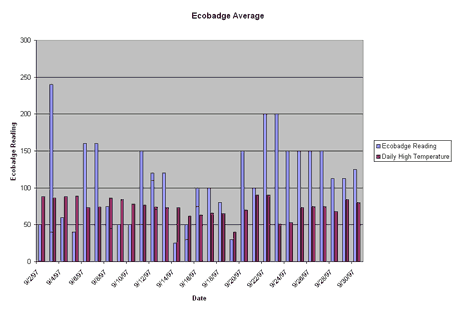 While bar graphs are interesting and a good way to visualize data, they have some problems. Line graphs show the relationship between two kinds of data in which the independent variable is continuous. After the proper points are plotted on the graph, they should be connected by a line. To line more about graphing and how to make various kinds of graphs, the DIGSTATS site should be helpful. The following is a line graph showing number of immigrants and year represents the same data presented in the bar graph. The line graph allows you to more clearly see trends. 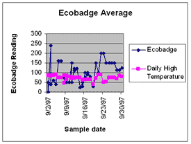 Making a Box Plot John Tukey has developed a technique which gives greater prominence to the dispersion, the spread of the data. This method is known as a boxplot, or a box-and-whisker plot. To learn how to construct a boxplot. The following is a boxplot of the data represented in the bar graph and in the line graph. 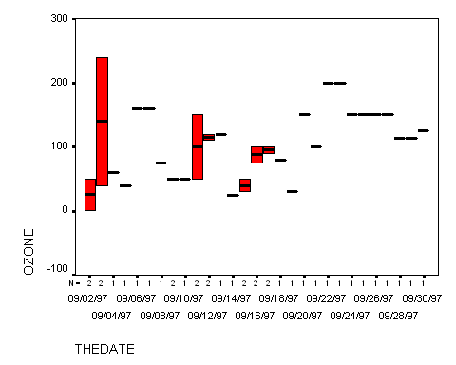 Using Geographic Information Systems for Analysis A geographic information
system (GIS) is a computer-based tool for mapping and analyzing things that exist and
events that happen on earth. The data that we have collected as a part of this project is well suited to GIS technology because it has a critical geographic dimension. GIS integrates common database operations such as query and statistical analysis with the unique visualization and geographic analysis benefits offered by maps. These abilities distinguish GIS from other types of analysis.
Geographic information systems work with two fundamentally different types of geographic
models - the "vector" model and the "raster" model. In the vector model,
information about points, lines, and polygons is encoded and stored as a collection of x,y
coordinates. The location of a point feature, such as a bore hole, can be described by a single
x,y coordinate. Linear features, such as roads and rivers, can be stored as a collection of point
coordinates. Polygonal features, such as sales territories and river catchments, can be stored
as a closed loop of coordinates.
I would like to work with the data in a map-based format. Using Systems Thinking - Modeling to work with data. Models are an important part of the explanatory part of science. Science is a practical study of what can be observed, and the prediction from that, of what will be observed. Models support moving beyond assimilating content to actually building understanding and effectively sharing this understanding with others. Using modeling software for analysis will build your capacity for, evaluating your models' congruence with reality and seeing complex interdependent relationships. Modeling is another tool of the practicing scientist. The STELLA software used by this project, uses a building block language that allows you to model the system of interest. The structure of virtually any system can be represented using just four icons! Sophisticated mathematics is not required to capture sophisticated relationships, as the STELLA software automatically creates the framework of equations needed to simulate the model. Once the model is constructed, simulations provide the opportunity to test the theories, observe results, and modify assumptions, thereby increasing your understanding of how things really work and how to make them work better. As you explore your data a number of questions will no doubt come to mind. Many of them begin with "Why".......which is good because it means you are ready to really begin the explanatory part of science. This process begins with establishing and refining your questions as a research question . If you do not have much experience with this process the Guided Research will help you begin working in the explanatory part of science. If you ready to jump in on your own go ahead and begin your work. If you need some helpful suggestions for how to proceed, or if you are ready to Publish My Research, this area will help you share the information you develop.
|
| © 1996-2006 PathFinder Science |
